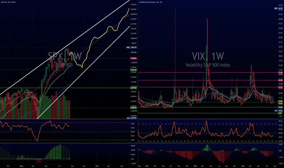
The TINA Blueprint: The Squiggle RoadmapBad news dominates headlines, yet equities refuse to break. The core driver remains institutional capital flow. Big money keeps asking; "where else capital can realistically go?" That dynamic represents the classic TINA backdrop, where There Is No Alternative.
Near term headwinds are building to trigger the next move. A curling Dollar Index TVC:DXY relief bounce, firm crude oil, and stubborn bond yields TVC:TNX provide the exact catalyst needed for a seasonal shakeout.
The Squiggle Roadmap
The squiggle kicks off with a standard seasonal pullback, dropping price down into lower channel support around the 7200 to 7300 zone.
October historically marks the turning point where major market bottoms form, completing that initial downward squiggly sweep.
Volatility measures remain low while building a base. A brief pop in fear flushes out late longs and sets up the ideal bounce off the lower channel boundary.
Once that shakeout finishes and yields stabilize, the squiggle carves out a steady grind higher toward the upper channel boundary into year end and 2027.
Wide price ranges create great setups for active positioning. Respect the macro pressures, buy the structural dip on the squiggle, and let the broader TINA momentum do the rest.
Of course, these are opinions and have a great week!
TGtg!
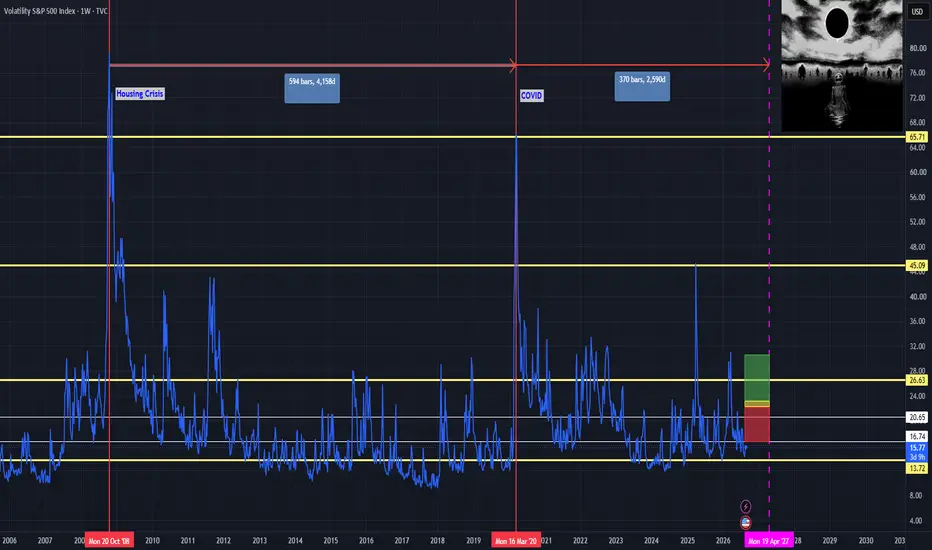
Volatility S&P 500 Index
No trades
No trades
In-depth trading ideas
VIX Unfazed After Warsh — 14.77 Is the Line for US500US500 sold off after Chair Warsh’s Jackson Hole speech. VIX barely moved.
That matters. When equities fall and volatility does not confirm, the selling looks more like event digestion than an acceleration of fear. Hike odds for September rose, but VIX failed to hold above 15. The market is not pricing this as an immediate panic event.
VIX range: 14.18–14.77
Support: 14.18
Resistance: 14.77
My rule is a 4H body close only.
Hold below 14.77: no confirmation of further US500 downside. Range remains the base case.
4H body through 14.77: look toward 15.70–16.30. That would be the first real fear confirmation.
4H body through 14.18: another VIX leg down, usually short-term supportive for equities — but snapbacks from these lows are common.
At 14-handle VIX, this is not a reason to chase equity shorts or longs.
The risk is the compression itself. Low-14s is already cheap. Jackson Hole often hits with a lag, and the next catalyst (jobs / inflation) can wake VIX up even if this range holds first.
#VIX
Reading the Tape: Market-Wide Squeeze and the Defensive RotationWhile retail traders chase daily headlines, look at the pure physics of the current market structure. We are experiencing a textbook volatility compression cycle coupled with an aggressive under the surface capital migration.
1. The Macro Squeeze Alignment
If you look across your daily layouts, a rare phenomenon is occurring: SPCFD:SPX , NASDAQ:NDX , TVC:DJI , NASDAQ:SOX , and the TVC:VIX are all locked in a tight TTM Squeeze simultaneously.
The market has ground to a halt. Price energy is being tightly coiled inside the Bollinger Bands and Keltner Channels. However, the internal mechanics tell an interesting story:
•The Indices: While price churns near support lines (like daily EMA), the momentum histograms are steadily losing upward velocity.
•The VIX: The selling of volatility has exhausted its downward momentum wave, and the daily RSI is quietly printing a string of higher lows.
When major equity indices lose steam while volatility finishes its downward cycle, the math warns chartists to be highly cautious. A market wide expansion wave is cooking, and the path of least resistance is testing critical floors.
2. Mapping the Institutional Rotation
Money doesn't simply vanish during a high beta growth cooldown; it migrates to "safe harbors". If you track the tape, institutional portfolio managers are actively rotating away from tech/chip fatigue and parking capital into other zones:
•The Biotech & Genomics Hybrid Growth Anchor: Vehicles like the VanEck Biotech ETF (BBH) are absorbing capital, alongside high sentiment genomics names like NASDAQ:NTLA , NASDAQ:TEM , and $CRSP.
•Classic Mega-Cap Defensive Staples: Heavy capital is actively flowing into defensive cash-cow shields like UnitedHealth NYSE:UNH , Medtronic NYSE:MDT , Kimberly Clark NASDAQ:KMB , and Clorox $CLX.
Conversely, the market is being highly selective and leaving behind specific names like PepsiCo NASDAQ:PEP , showing that this is a targeted, professional flight to structural strength rather than a blind value rally.
The Trading Blueprint
When the entire market coils into a squeeze, the worst thing a trader can do is get chopped to pieces trying to trade mid-range intraday wiggles.
1.Protect your near-term capital from sudden downside uncoiling.
2.Let the white dots flip to a fresh directional expansion wave.
3.Keep a close eye on the weekly charts to find the ultimate "line in the sand" structural floors.
Trade the reality on the screen, not the noise in the news.
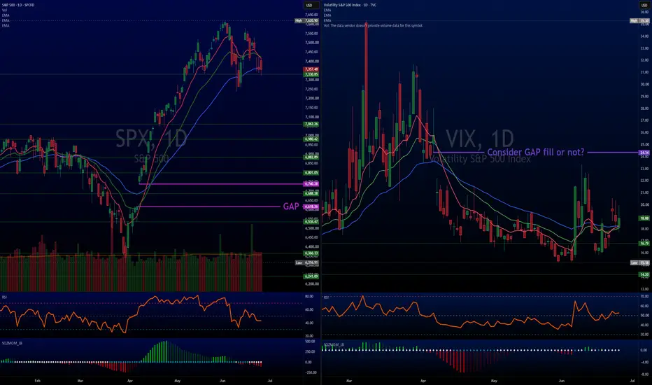
The Catalyst Wall: Why Caution Is RequiredThe probability of a technical bounce off this lower trendline over the next 2-3 trading sessions sits around, OPINION, 60% to 65%. The technical setup strictly favors a short term reactive pop, but major event risk over the next 48 hours makes any sustained directional follow through a coin flip.
Technical Data for a Bounce
SPCFD:SPX : Price is sitting right on the lower symmetrical trendline of the multi month symmetrical triangle. In classic chart mechanics, initial tests of major ascending trendlines within a triangle yield a reactive bid as systematic buyers and long hedges defend the floor.
RSI Midline Reset: The lower yellow box shows SPCFD:SPX RSI resetting down to the 35-40 range. It is not deeply oversold, but it has washed out the short term froth and matches the exact RSI levels from the prior swing lows along this lower yellow line.
TVC:VIX :
This is giving back gains right as SPCFD:SPX hits support is rarely a coincidence. The VIX hit overhead horizontal resistance around 19.50 (reddish line) and is struggling to break through.
As long as VIX stays capped under 19.50 and rolls back down toward its lower support line, it acts as a short term volatility release valve, giving equities room to breathe upward.
Why CAUTION is required:
A technical bounce is favored on pure chart physics, but the macro schedule for the rest of this week will dictate whether a bounce holds or turns into a violent breakdown:
FOMC Rate Decision (Wednesday): The Fed meeting lands Wednesday afternoon. A hold is expected, but Chair Warsh’s commentary will drive immediate volatility.
Mega Cap Tech Earnings Cluster: NASDAQ:MSFT and NASDAQ:META report Wednesday after close, followed immediately by NASDAQ:AAPL and NASDAQ:AMZN on Thursday.
Q2 GDP & Core PCE (Thursday): Crucial macro inflation data hits right in the middle of earnings.
TGTG!
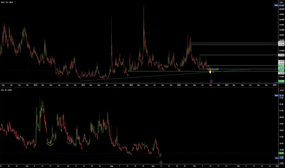
$VIX: Coiling for a Move? 1D & 4H Analysis
Market volatility has spent weeks grinding lower, but the charts are signaling that a shift could be right around the corner.
What the Charts Are Showing:
Strong Floor Defended: Volatility swept down to multi month lows and bounced back. Buyers stepped in to defend the baseline === downside protection and option demand picked up.
Energy is Building (Daily): The downward selling pressure has steadily dried up on the daily timeframe. When momentum compresses like this after testing major support, it often acts like a coiled spring.
Short Term Resistance Test (4Hr): The move is taking a quick breather near short term moving averages. A clean break over 16.00 opens up room for momentum to accelerate. (started to move higher as we wrote this, so gaining some steam)
Takeaway:
While the short term chart is catching its breath at resistance, the bigger daily picture shows volatility setting a higher low and coiling up. Keep an eye on broad market risk if TVC:VIX strongly clears 16.00.
Not financial advice. Manage risk accordingly.
TGtg!
TVC:VIX School:
The Underlying Engine (SPX Put Demand): VIX is calculated from SPCFD:SPX option prices. When institutions rush to buy out of the money SPX put options for downside protection, implied volatility expands, which mathematically pushes the VIX upward.
Derivative Flow (VIX Futures & Calls): Traders and hedgers buy VIX front month futures or VIX call options when they anticipate a market pullback, which bids up volatility pricing across the curve.
Buy Idea: S&P 500 Volatility Index (VIX)Key Drivers:
The surge in US (and global) bond yields has not been a problem for equities however, intervention by the officials may raise cause for concern.
Our technical screeners (using ETFs) reflect an extreme lack of oversold instruments and a vast number of overbought instruments
S&P 500 Index +38% above it's 200-week SMA (2nd highest reading since the year 2000). In addition, a bearish distance divergence is present.
72% of S&P 500 shares trade above their 200-day simple moving averages. While this is healthy, this is at the upper boundary of a 5-year range.
Volatility seasonality - nearing a period (measured over 20 years of data) where the VIX has shown historical elevation.
Buy at current levels (15.15) or lower
Stop-loss: 12.20
Target: 20.00
ORCHESTRA VIEW EP II: Events, Policy And What To WatchFOUR RULES ABOVE EVERYTHING
1. The market is always right.
2. Every price is already set.
3. Every view is a quantum view — stay flexible, keep every state open.
4. All evolution comes through repetition.
The first post in this series took the dollar index apart, measured 42 instruments
on two axes and showed where each group ends. This one is what you do with it —
how an event travels through the net, what goes on the screen, and what the clock
does to all of it.
===================================
PART FIVE — EVENTS, POLICY AND WHICH WAY THE SEESAW TIPS
===================================
An event does not move "the market". It lands at one point in the net and travels
only as far as the correlations let it. The map does not tell you the direction.
It tells you the route, and which rooms the news can even reach.
THE SEESAW IS VOLATILITY, NOT THE DOLLAR
Of the 41 instruments measured against volatility, 35 sit on the opposite side.
Against the dollar, only 8 do, and all eight are currencies or precious metals.
So when people say risk-on and risk-off, the thing actually doing the tilting is
volatility. The dollar is the unit on the price tag, not the fulcrum.
That single fact decides what belongs beside everything else on your screen.
RATE POLICY LANDS ON THE CURVE, THEN SPLITS
Policy arrives at the rates layer first, and the curve does not transmit it as one
piece. The 2-year reads plus 0.134 against the dollar and minus 0.160 against
volatility. The 10-year reads plus 0.090 against the dollar and minus 0.251 against
volatility. Same curve, two different exits — the short end leans currency, the
long end leans risk.
So a policy surprise reaches currencies through one door and equities through
another, and the two doors do not open at the same speed. Watch both ends of the
curve, not one number called "rates".
US 2-year yield, weekly. The short end leans currency.
GEOPOLITICS USUALLY LANDS ON ENERGY — AND STOPS THERE
This is the part that surprises people. Energy is weakly attached to both axes.
Crude reads minus 0.122 against the dollar and minus 0.221 against volatility.
Natural gas reads minus 0.083 and minus 0.062 — two coin flips.
A supply shock therefore does not automatically tip the whole board. It has no
strong correlation to travel along.
Crude, weekly. Minus 0.122 against the dollar, minus 0.221 against volatility. It has to work through inflation into policy
into the curve before the rest of the net feels it, and that is a slow route with
nothing to ride on. Which is why an oil headline can dominate one screen and leave
the other seven groups unchanged.
AGRICULTURE SITS OUTSIDE THE MAP ENTIRELY
Cohesion 0.226, and neither anchor explains it. Corn is minus 0.138 against the
dollar and minus 0.072 against volatility. Weather, harvest and policy sit above
both axes. This is the one group where the reading has to come from the news and
the release calendar rather than from the correlation map, and saying so is more
useful than pretending the map covers everything.
WHAT I HAVE NOT MEASURED
I have not run event studies around specific releases, so I will not put a number
on how any single announcement propagates. Everything above is structural: it says
where a shock can travel, based on long-run correlations, not how far it went on
any particular day.
And there is a real limit in that. These correlations are averages across the whole
sample. Event days are not average days, and I have not measured them separately.
Treat the map as a list of rooms to check after news lands, not as a forecast of
which room will be loudest.
===================================
PART SIX — WHAT TO ACTUALLY PUT ON THE SCREEN
===================================
Everything above is why. This part is what. One routine per asset class, and the
same three directions running underneath all of them.
BUYING A SINGLE STOCK
Open the stock, then open the index that contains it, then open the other national
indices. A stock cannot tell you whether today belonged to the company or to the
market. The index answers that, and the other countries answer whether it was even
that market. And keep volatility on screen the whole time — every one of the four
US indices reads between minus 0.67 and minus 0.72 against it, while the dollar
reads under minus 0.14. Volatility is the axis that actually moves them.
TRADING INDEX FUTURES
The same, one layer deeper. Open all the national indices, then go down into the
constituents. Dow is 30 names, Nasdaq is 100, S&P is 500, Russell is 2000. Looking
at the index alone and looking at the index plus its members are different
activities, and over time they produce different people. The index is an average,
and an average prints the same line whether half the names are falling or almost
none are. Volatility again stays open throughout.
METALS
Five on screen, always together — gold, silver, copper, platinum, palladium.
The group only looks like a group from outside. Gold and silver hold at 0.73,
platinum and palladium track each other, and copper sits at 0.25 against gold.
Watching all five is how you see which of the three sub-groups is moving. Watching
one is how you mistake a growth move for a currency move.
Copper, weekly. 0.25 against gold — the growth end of the metals.
ENERGY
Four oils together — crude, Brent, gasoline, heating oil. Natural gas on its own
screen. Crude and Brent hold at 0.92, the refined pair carries the demand signal,
and the Brent-crude gap carries regional supply. Gas reads 0.16 against all of it,
so putting gas in the same frame as the oils cancels what each is telling you.
Natural gas, weekly. 0.16 against the oil complex — its own screen.
CURRENCIES
The dollar index and the euro first, because between them they define the axis.
Then the individual currencies, including the ones with zero weight in the basket.
The won and the yuan carry no weight at all and still move with it, which means the
basket is not the market.
USDKRW, weekly. Zero weight in the basket, and it still moves. Check the quote direction before grouping anything —
USDCHF reads plus 0.838 against the dollar index and that is a quoting artefact,
not agreement.
AGRICULTURE
Take the whole group first, then the individual name, then the news and the
economic releases behind it. The numbers were in the last part — cohesion 0.226,
both anchors near a coin flip — so this is the one class where the chart layer is
not enough, and the reading has to come from outside the price screen.
THE COMMON THREAD
Every routine above is the same three directions. Up to the unit, sideways to the
group, down to the parts. Volatility sits beside all of them because it is the one
axis that touches every risk asset, and the correlation map tells you where each
group ends so you are not reading two charts that say one thing.
===================================
PART SEVEN — TIME IS A GROUP TOO
===================================
Take one instrument and read its direction across nine lookbacks: 10, 30, 60, 180,
345, 480 and 690 minutes, then daily and weekly. Then count how often those nine
point the same way.
Nasdaq futures — all nine agree 14.4% of the time, three to six split 42.6%
Gold — 13.0% and 47.3%
Dollar index — 9.1% and 49.3%
Bitcoin — 7.9% and 51.7%
WTI — 6.8% and 48.3%
Nine timeframes speak with one voice between 7 and 14% of the time. About half the
time they disagree outright, and a single chart throws that disagreement away. The
rare tenth where everything lines up is information precisely because it is rare.
If you read the gold post earlier in this feed, this is the same thing measured.
There the weekly and the monthly were pointing opposite ways on the same instrument
at the same moment, and the question was which state resolves first. That was not
an anomaly worth explaining away. It is the normal condition, and here is how often
it happens across five different instruments.
The first weeks of doing this are slow. They are slow because it is new, not
because the method is slow.
Next — Grouping, Three Gates And Four Rules: why looking together and holding
together are opposites, where the earlier posts in this feed stand, and what
happened when I put my own claims through three statistical gates.
VIX - Hedge or Spec?Looking at TVC:VIX this week, the opening print of $14.98 struck me as a little odd. You don't have to stick your head out far to see there's more than a fair share of uncertainty around the globe this summer, and for market-oriented folk I am sure by now you are feeling the heat.
The omnipresent blip on every trader's radar, the conflict in Iran, and tenuous logistics surrounding the strait of Hormuz persists. Yet I can scarcely imagine a professional who is jumping into Crude Oil NYMEX:CL1! crude longs at the rumor, or even the outright news of a flare up by now. The heavy hitters called this one baked in back in April, and the print has read true on this verdict since. We still see elevated prices compared to the better part of the last decade, but crude oil is not the focus of this post.
Let's take a look into some of the fallout from this price shock, and how 'priced in' may have translated into the lowest volatility print since January.
The above chart is a 1 year line chart of volatility indicators for the major market indices, S&P500 vol - TVC:VIX (blue), Nasdaq vol - CBOE:VXN (red), Dow Jones Industrial Average vol - CBOE:VXD (green), and US Bond market vol - TVC:MOVE (orange). We have laid these out on a percentage change basis, where some interesting trends emerge. We see that the three equity benchmarks are retracing to pre-conflict lows, though Nasdaq vol remains elevated we will get into that later. The benchmark for bond volatility has been trending upwards, spiked with the war but has not retraced below the lows it made in April as the market rebounded. This is important, as options contracts take a bearing of both equity and bond volatility when it comes to pricing. So we may see both VIX and MOVE as independent but correlated underlying parameters of SPX equity options, which is a growing market at this time as investors seek cheap leverage and hedging. Which begs the titular question - are we seeing speculative buying of SPX or upside hedging of the VIX?
Here we have a 5 year bar chart of VIX volatility - CBOE:VVIX (white) and VIX - TVC:VIX (pink), as well as some basic trendlines (green). For those not well versed in options pricing or fractality, implied volatility is a bit of a mathematical perplexity, but as a result we have the volatility of the volatility as a parameter that can be measured. What we clearly see is an uptrend in this measure, meaning VIX hedging is getting more expensive. This is doubly-so, if we consider that MOVE is also a parameter at play, and the uptrend there pushed options premiums higher across the board. Interestingly, where the VVIX held it's uptrend the VIX appears to break down, though neither market is producing higher highs at this time, only the VIX is threatening lower lows.
Now here is an interesting trend, that I wish to make note of, though I caution looking too deeply into. Above is a 5-year bar chart of DJIA vol - CBOE:VXD (white), above its Average True Range - ATR (lower window). The distinct pattern of this market appears to have disappeared, the range of its movements becoming suddenly very tight and orderly in late April '26, further indicated by the ATR. What this means, I cannot speculate. But investors should consider that volatility markets are under the bright lights of large institutions at this time.
Above is a messy chart, with the US 10-year benchmark yield - TVC:US10Y (white) and a handful of tech companies that have been leading the recent rally. Goldman Sachs Group - NYSE:GS (pink) is also tucked in there. These companies have been expanding rapidly, and putting a lot of debt on the table as a result. Many of us are aware of the credit implications of the 'AI boom' - which I believe under no circumstances at this time is a bubble - let me be clear. Yet as interest rates and inflation rise due to geopolitical instability, the current valuations of these markets even as they back off all-time-highs, should be considered in the light of the VIX making new lows.
Consider the long-term view, and the complexity of potential positioning on Wall Street at this time. The credit instruments involved, and the hedging flows pass through a deep market of complex derivatives, all of which see MOVE on the rise. With VVIX moving in lockstep, I would suggest that VIX is being heavily hedged against the upside, with volume across the tech sector in downtrend and the credit cycle tightening. We could see a pause at this level or further decline in equities.
VIX Daily: Extreme Low Volatility, Watching for Mean ReversionVIX Daily Analysis
1. Current Status: Structural Weakness and Extreme Low Volatility
After key events (July 31 PCE and August 12 CPI) passed without major surprises, volatility selling accelerated into the August 14 options expiration. VIX has fallen to its lowest level of the year at 14.18 and continues to trade in the mid-to-low 14s.
Technically, the clear break below the July 10 swing low at 14.96 confirmed a daily Bearish BOS. Since then, pullbacks have remained extremely shallow while lows continue to be taken out. This is less a clean trend continuation and more an overshoot driven by excessive selling pressure.
Price is significantly extended below both the EMA20 and EMA50, reflecting a short-term imbalance in supply and demand.
2. Strategy: Waiting for Initial Confirmation of Mean Reversion
When VIX diverges this sharply from its moving averages, historical patterns suggest an elevated probability of reversion toward the EMA20 (currently near 16.0) and EMA50 (currently near 16.9). This is not a prediction that a rebound “must” occur, but rather a recognition of the asymmetry: if a rebound does materialize, the impact tends to be meaningful.
The most important early signal is a decisive reclaim of the recently broken level at 14.96. A recovery above this level would increase the likelihood that mean reversion is underway.
A rebound in VIX would add downward pressure on both US500 and JP225. With equity indices trading near all-time highs while VIX remains at depressed levels, any meaningful return of volatility has the potential to amplify corrective moves.
Invalidation:
A clear break below 14.18 followed by continued lower lows would delay the mean-reversion timing. In that case, the current waiting stance would be reassessed.
3. Conclusion: A Situation with Relative Edge — After Confirmation
VIX currently combines structural weakness (Bearish BOS) with extreme deviation from its averages. Further downside would require additional strong positive catalysts, which appear limited at present.
Therefore, if VIX reclaims 14.96, short setups on US and Japanese equity indices would enter a relatively favorable environment. The approach remains unchanged: wait for confirmation of the rebound, then act. This is a phase for patiently monitoring mean reversion against excessive optimism.
#VIX #Volatility
VIX | Bullish Reversal Signals Point to Higher VolatilityThe Volatility Index (VIX) is showing signs of building bullish momentum after finding support in a key reaction area. The current price structure suggests buyers are stepping back into the market, increasing the probability of an upward move. If buying pressure continues, VIX could extend its recovery toward the next resistance zone, reflecting a rise in market volatility and growing uncertainty across risk assets.
Why the $VIX Refuses to RiseThe current weakness in the Volatility Index is not just a reflection of market calm, but a direct outcome of structural mechanics in option pricing.
While technical charts on broader equity indices show daily momentum fading, the TVC:VIX continues to press against its key range floor. ***This persistent suppression stems directly from a heavy structural supply of option selling across the market.***
How VIX Pricing Works
The VIX measures the price of S&P 500 options. When traders continuously sell calls or sell puts for income, they flood the market with options supply. To absorb this supply, market makers lower their bid prices, which directly pulls the VIX lower.
No Scramble for Protection
Big VIX spikes happen when investors rush to buy portfolio insurance at any cost. Without panic buying to push option prices higher, everyday time decay continually erodes option values.
Constant Supply of Short Options
Income strategies and option funds create a steady stream of option selling. This continuous supply easily absorbs normal buying demand, keeping volatility low even as stock momentum cools off.
A low VIX simply means option prices are cheap due to heavy selling supply, not that market risk has disappeared. Low volatility reflects cheap insurance driven by heavy option selling supply rather than a total absence of risk.
VIX: news flow leaning bullish — the net read
VIX did not get one story today, it got several, and they do not all point the same way. Weighed against each other — new against old, and tracking which ones have already faded:
+ BofA CEO Moynihan sees three Fed rate hikes through year end 2026 (fading)
+ Fed's Cook: Fed running out of room for disnflation to return (fading)
+ We've reached an impasse on the Japanese yen trade (fading)
16 stories were weighed in this window; the 3 carrying the most weight are listed.
Net read: ++ leaning bullish — solidly weighted.
What this is: a measure of which way the *news* is leaning right now — not a promise about price. A read being right and a read still being worth taking are two different things: once price has travelled a long way from where the read was published, it is stretched, and a lean that is stretched is a no-chase rather than an invitation.
Weight is not fixed either. A fresh headline lands, the balance tips, and the net read can flip inside an hour — that shift is the part worth watching, not the first print.
I will post an update under this idea once the market has had time to speak, either way.
(Informational only — not financial advice, not a signal.)
Part 2: Weekly VIX and TACO TradeZooming out to the weekly chart gives us a much clearer view of the macro picture without all the daily noise.
The Multi Year Floor
The weekly chart makes the long term picture easier to understand. The VIX has a clear floor that shows up again and again. Most of the time it stops falling in the same zone between thirteen and fifteen. Every time it reaches this area it bounces or moves sideways. This tells us the market is calm but not careless. Traders still want some protection and that keeps the VIX from breaking down.
Enter the TACO Trade
So why does fear stay so suppressed? A huge driver in this market is the TACO trade dynamic: "Trump Always Chickens Out" (or more broadly, the expectation that tariff, war, and policy threats will eventually be walked back or negotiated down).
This is the kind of environment where the market slowly grinds higher. The weekly chart supports that idea. The VIX is resting on strong long term support. There is no sign of panic. There is no sign of a major shift in trend. Even with global tension and political noise the market has stayed steady. That is what the TACO trade looks like. Calm, steady, and driven by strong tech leadership.
The Big Takeaway
As long as the market believes maximum downside threats won't fully materialize, volatility will likely bounce around this 15 area while stocks grind upward. Just remember: when everyone gets too comfortable expecting the walk-back, a real unexpected shock can trigger a very sharp move back toward 20 or higher.
Pt 1 Daily VIX Setup Quiet Before the StormThe daily chart shows the VIX sitting near the lower end of its usual range. This is the area where volatility often slows down and the market feels calm. Even though the VIX is low, it is not falling apart. The indicators on the chart still show signs of strength. The RSI is holding steady instead of dropping. That means traders are not fully letting go of protection. The true absolute bottom line in the sand sits closer to 13, but buyers keep stepping in before it ever gets there.
There are several clear support levels under the current price. These levels have held many times before. When the VIX reaches these zones it usually stops falling and starts moving sideways. Sometimes it even pops back up. The chart also shows open gaps, not see on line charts, above the current price. Gaps often act like magnets. When the VIX starts rising again it often moves toward these gaps.
What Comes Next?
When fear stays this compressed at the bottom of a range, downside room becomes limited. A quick push can open up a fast move toward 20, with a major overhead gap waiting near 24 to 25 if a real catalyst lands.
As long as headline threats get walked back, markets can continue a slow grind higher. Just keep in mind that sitting at the bottom of the range means volatility is cheap and coiled for the next spike.
VIX - Last Action-Reaction Set and a Long ConsolidationSince I objectified my methods I don't draw a single line even by chance, everything comes from the systems' automatic calculations, including the trading. That being said, this is the last and only median line detected in VIX, which by the way, generated the typical "buying at a discount" trade:
The issue now is that since this trading range was created, prices could never overcome a new high or low, but rather began to contract within the range.
Low intact:
High intact:
So ultimately, we have been trading inside the same range for about 2 years. Without anything new occurring, I am stuck with the same median line.
It is a complicated outlook because I generally do not get involved with anything that is not practically perfect. Having a multitude of markets, I have no need to put focus on something that has been trading inside the same range for 2 years. I will go look for a market with a clear trend and that's it.
But since the point here is to define where the risk is, I believe that what is happening is this:
VIX is in a bearish trend (see how at a certain point prices begin to move outside the lower parallel)
But even so, by being in the lower part of the range, it is quite prone to creating bullish pullbacks before continuing to drop in a sustained manner.
So ultimately, here the risk is to the upside for me; the risk is that prices rise before going down again.
In fact, if we go to the 30m to see what is happening with a more granular look, the system marked the buy signal for me right there:
Bearish on the indices and bullish on the VIX is the profile in my opinion.
I hope it is of some use, perhaps in convergence with the last post that defines the risk in the Dow Jones, regards.